Remember those stark, all-white bathrooms that looked like they belonged in a hospital or a high-end showroom? The ones where you were almost afraid to touch anything for fear of leaving a smudge? Yeah, those days are pretty much over. If you’ve walked into a newly renovated home lately, or even just scrolled through design feeds, you’ve probably noticed a distinct shift. The air feels warmer. Literally and figuratively.
We are seeing a massive move away from the cool grays and clinical whites that dominated the last decade. In their place? Rich taupes, soft creams, muted sages, and deep terracottas. It’s not just a fleeting fad either. According to recent industry reports, about 75% of design professionals confirm that warm, earthy tones have officially taken the throne from cool neutrals. It’s a big change. And honestly? It’s about time.
This isn’t just about painting a wall beige. It’s a fundamental shift in how we view our private spaces. The bathroom is no longer just a functional room for getting clean. It’s becoming a sanctuary. A place to decompress. And nothing says "decompress" quite like colors that mimic the natural world. Let’s dig into why this is happening, what colors are leading the charge, and how you can bring this grounded, calming vibe into your own home without feeling like you’re stuck in the past.
The Psychology of Calm: Why We Crave Warmth Now
So, why the sudden love affair with warm tones? It’s not random. Think about the last few years. Life has been fast, loud, and often unpredictable. Our homes have become our offices, our schools, and our gyms. We are spending more time indoors than ever before. When the outside world feels chaotic, we want our inside world to feel stable. Grounded. Safe.
Cool colors like bright white and steel gray can feel crisp and clean, sure. But they can also feel sterile. Distant. They don’t always invite you to linger. Warm neutrals, on the other hand, wrap around you. They mimic the colors of nature—sand, stone, wood, clay. These are colors our brains associate with safety and comfort. It’s primal, really. When you step into a bathroom painted in a soft mushroom or creamy off-white, your nervous system gets a subtle signal to relax.
Designers are noticing this too. They aren’t just picking colors because they look good in a magazine spread. They are choosing them because they support well-being. The trend toward "spa-like" spaces isn’t just about having a fancy showerhead. It’s about creating an atmosphere that lowers your heart rate. Warm tones do that. They absorb light rather than reflecting it harshly, creating a softer, more intimate glow. It’s the difference between standing under fluorescent lights and sitting by a candle. One wakes you up; the other helps you breathe.
Saying Goodbye to the All-White Obsession
For a long time, white was the safe bet. It made small spaces look bigger. It matched everything. It was easy. But easy doesn’t always mean better. The problem with all-white bathrooms is that they lack soul. They can feel temporary, like a hotel room you’re passing through rather than a space you inhabit. And let’s be real, keeping an all-white bathroom clean is a full-time job. Every splash shows. Every dust mote stands out.
The shift away from white is one of the biggest stories in 2026 design. It’s not that white is gone completely. It’s just no longer the default. Instead of stark, bright white, we are seeing "softened whites." Think of the color of unbleached linen or old parchment. These shades have yellow or brown undertones that take the edge off. They feel lived-in. They age gracefully.
Experts say that homeowners are prioritizing natural light in their designs now more than ever. About 62% of experts note this priority. Why does that matter? Because warm neutrals play beautifully with natural light. In a north-facing bathroom that might feel cold and dark with gray walls, a warm taupe or sandy beige will catch the limited light and make the space feel cozy rather than cavernous. In a sunny south-facing room, these tones keep the space from feeling too hot or glaring. They are versatile chameleons. They adapt. White just sits there.
The Palette of the Year: From Mushroom to Terracotta
If you are ready to ditch the gray, what should you pick instead? The palette for 2026 is rich and varied, but it all shares that common thread of warmth. It’s inspired by the earth, literally. You won’t see many neon brights here. Instead, think of the colors you’d find on a hike.
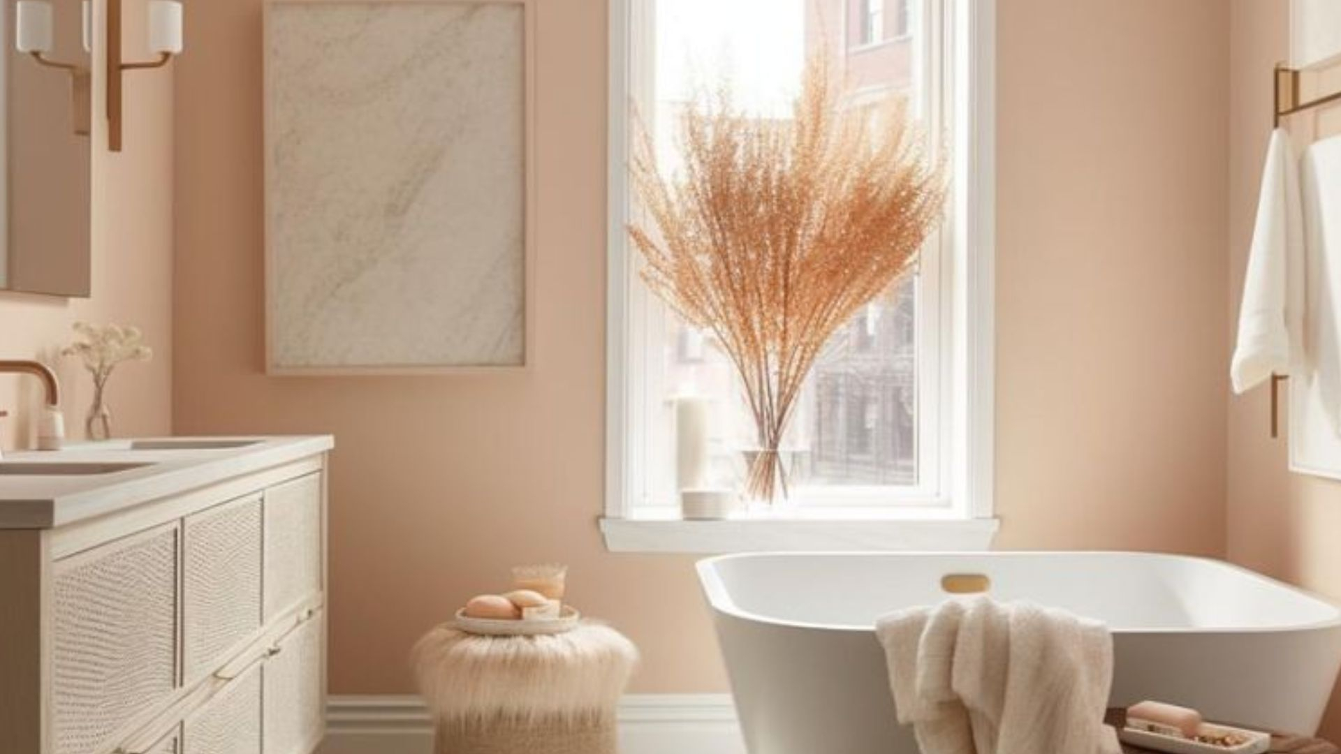
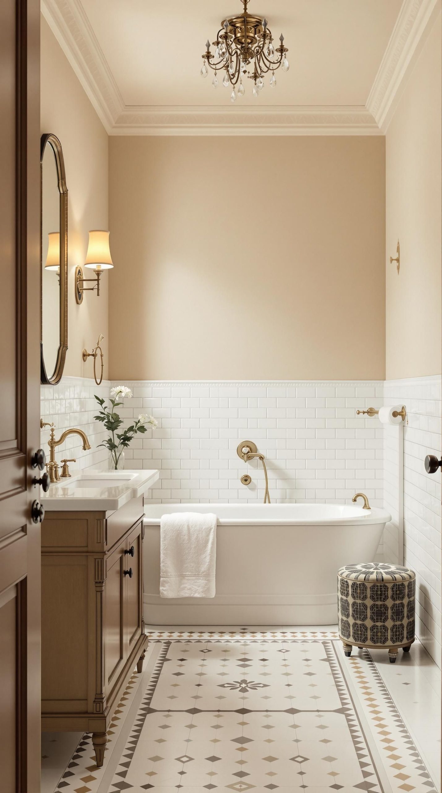
First, there are the "new neutrals." These include shades like mushroom, putty, and warm greige (a mix of gray and beige). Benjamin Moore’s "Seapearl" is a popular example, offering a soft, creamy warmth that acts as a perfect backdrop. These colors are subtle. They don’t shout. They whisper. They allow other textures, like wood or stone, to take center stage.
Then, we have the earthier accents. Terracotta is having a major moment. It brings a Mediterranean warmth that feels both exotic and familiar. Muted sage greens are also huge. They connect the indoor space with the outdoors, bringing a bit of the garden inside without being too literal. And for those who want something deeper, rich charcoal and clay shades are being used to create drama and depth, especially in larger bathrooms or on feature walls.
It’s not just about paint either. These colors are showing up in tiles, vanities, and even fixtures. Imagine a vanity in a warm oak finish paired with terracotta floor tiles. Or shower walls in a textured, sandy beige stone. The key is layering. You don’t need to paint every surface the same color. Mix a creamy wall with a darker, earthier tile. Add some brass hardware. It creates a look that feels curated and thoughtful, not just slapped together.
Texture and Material: The Secret Sauce
Here is the thing about warm neutrals: they can look flat if you aren’t careful. If you paint a room beige and use beige tiles and a beige rug, it might just look boring. Monotone. The secret to making this trend work is texture. Since the color palette is subdued, the interest comes from how light hits different surfaces.
Think about natural materials. Wood is a big player here. A floating vanity in walnut or oak adds instant warmth and grain pattern. Stone is another favorite. Travertine, limestone, and marble with warm veining are everywhere. These materials have inherent variation. No two pieces are alike. That imperfection is what makes them feel human and authentic.
Metallics play a role too. Gone are the days of chrome being the only option. Brushed brass, bronze, and copper are the go-to finishes for faucets, showerheads, and towel bars. Why? Because they complement warm tones perfectly. Chrome can feel cold against a terracotta wall. Brass feels like it belongs there. It adds a touch of luxury without being flashy.
Even your textiles matter. A plush cotton towel in a oatmeal shade feels different than a crisp white one. A woven seagrass basket for storage adds organic texture. These small details build up to create a space that feels tactile. You want to touch things. You want to feel the roughness of the stone and the smoothness of the wood. That sensory experience is part of the relaxation.
Creating Your Own Spa-Like Retreat
You don’t need a complete renovation to jump on this trend. In fact, some of the best updates are small and strategic. Start with the walls. Paint is the cheapest and most impactful change. Swap out that cool gray for a warm taupe or a soft cream. Notice how the light changes in the room. Notice how it feels different when you walk in.
Next, look at your accessories. You don’t need to replace your vanity if it’s white. Just warm it up. Add a wooden stool. Swap out chrome knobs for brass ones. Hang a piece of art with earthy tones. Bring in a plant. A simple fern or pothos can add life and greenery that complements the warm background.
Lighting is crucial. Warm neutrals need warm light. Check your bulbs. If you are using daylight bulbs (which are blue-toned), switch to soft white or warm white (around 2700K-3000K). This will enhance the yellow and brown undertones in your paint and tiles, making the space feel golden and inviting in the evening. It’s a small change that makes a huge difference in mood.
Also, consider your shower curtain or glass enclosure. If you have tiles, maybe they are already earthy. If not, a shower curtain in a linen-like fabric with a subtle texture can soften the look. The goal is to reduce visual noise. Clutter feels stressful. Warm, simple spaces feel calm. Keep surfaces clear. Use baskets to hide the everyday stuff. Let the colors and materials breathe.
One worry people have with trends is that they will date quickly. Will we look back at 2026 bathrooms and cringe? Probably not. That’s the beauty of warm neutrals and earthy tones. They are timeless. They have been used in architecture and design for centuries. Think of the adobe homes of the Southwest or the stone villas of Italy. These colors don’t belong to a specific decade. They belong to the earth.
Unlike bold, trendy colors like millennial pink or avocado green, warm neutrals are flexible. If you get tired of the look in five years, you don’t need to repaint. You just change the accessories. Swap the brass for black matte. Change the towels from sage to rust. The backbone of the room remains solid and elegant. It’s a sustainable approach to design. You buy quality materials that last, in colors that don’t scream for attention.
This longevity is why designers are so excited about it. It’s not just a flash in the pan. It’s a return to basics. To comfort. To authenticity. People are tired of disposable decor. They want spaces that feel rooted. Spaces that tell a story. A bathroom with warm wood, stone, and soft paints feels like it has history, even if it was just built last month. It feels permanent. And in a world that changes so fast, that feeling of permanence is precious.
So, if you are planning a refresh, don’t be afraid to lean into the warmth. Ditch the sterile white. Embrace the imperfections of natural stone. Let the light filter through linen curtains. Create a space that doesn’t just look good, but feels good. Because at the end of the day, that’s what our homes are for. Not to impress strangers, but to comfort us. And nothing comforts quite like the embrace of the earth.