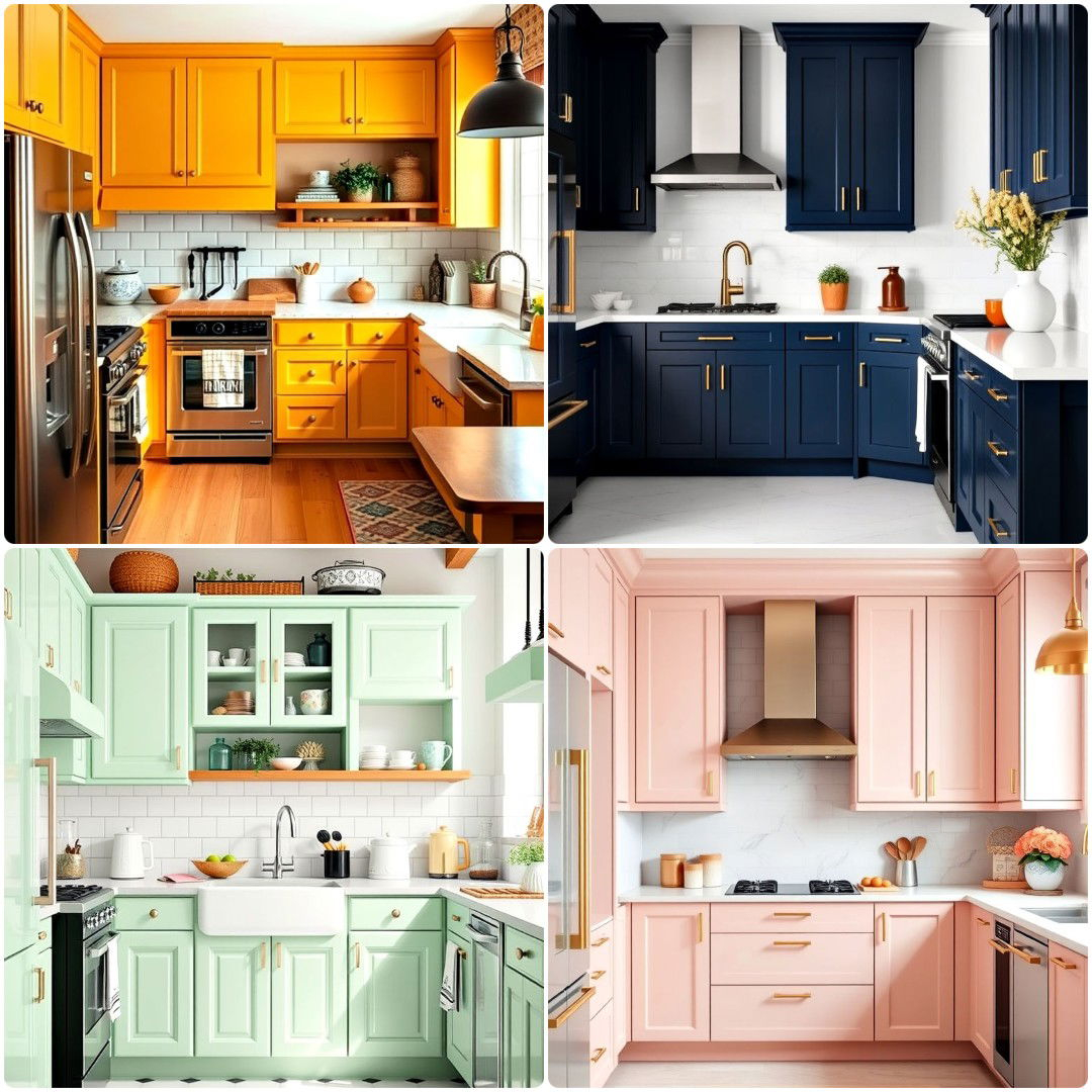
Choosing a kitchen color scheme shouldn’t feel like so high-stakes, but somehow it always does. Maybe it’s because the kitchen is where we actually live —making coffee, hosting friends, scrolling through our phones while dinner simmers. Or maybe it’s because the wrong shade of white can haunt you for years. We’ve all been there. Standing in the hardware store aisle, holding three nearly identical samples of "cream," wondering if one will turn yellow under your lights or if another will look stark and cold. It’s exhausting. And expensive if you get it wrong.
But here’s the good news: you don’t need to guess anymore. After more than 17 years of watching trends come and go, one thing has stayed consistent across countless homes: color choices matter more than almost any other design decision. Cabinets, floors, and countertops are not quick swaps. When the color scheme feels dated, the entire kitchen follows. That is why the most successful kitchens rely on balanced, proven color frameworks rather than fleeting impulses. In 2026, the focus isn’t just on what’s trendy; it’s on what works. It’s about creating a space that feels cohesive, inviting, and full of personality from wall to cabinet to countertop.
Understanding the Foundation: Light, Material, and Undertones
Before you even think about picking a swatch, you need to understand how light, material, and sheen rewrite a color’s story in the room. This is where most people trip up. They pick a beautiful gray online, paint their walls, and suddenly it looks purple. Why? Because they ignored the undertones. Every color has a hidden bias. A white might have blue, green, or yellow undertones. A gray might lean warm (beige) or cool (blue). If your cabinets have warm wood tones and you pair them with a cool, blue-based gray, the clash will make both look off. It’s subtle, but your eye will catch it immediately.
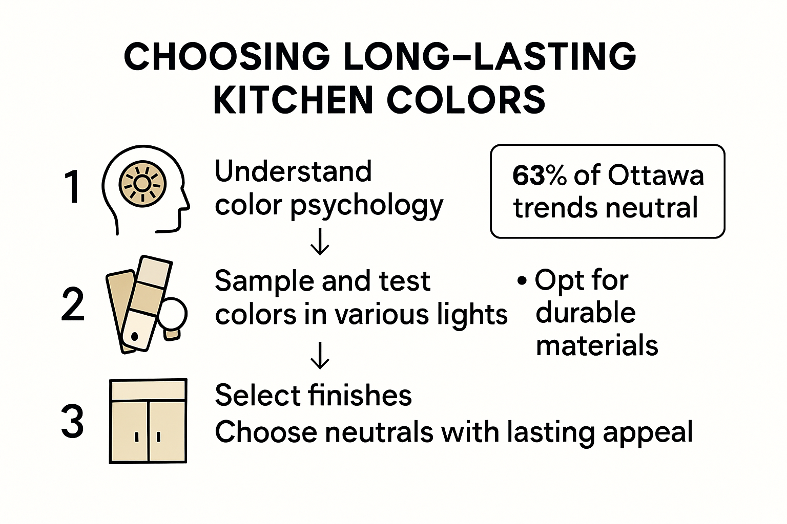
Lighting plays an equally huge role. Natural light changes throughout the day, shifting from warm morning gold to cool afternoon blue. Artificial lighting—whether it’s warm LED bulbs or harsh fluorescents—will also alter how your colors appear. A dark navy might look rich and cozy at night but feel like a cave during a cloudy day if you don’t have enough ambient light. The key is to test your colors in the actual space. Paint large samples on different walls. Look at them in the morning, noon, and evening. See how they interact with your fixed elements like flooring and countertops. Don’t rush this step. It’s the difference between a kitchen that feels right and one that feels slightly "off" without you knowing why.
Also, consider the sheen. Glossy finishes reflect light and make colors appear brighter and more intense, while matte finishes absorb light, making colors feel softer and deeper. In a kitchen, durability matters too. High-traffic areas like cabinets often benefit from satin or semi-gloss finishes that are easier to wipe down, while walls might look better in eggshell or matte for a sophisticated, non-reflective look. Balancing these textures adds depth to your color scheme, preventing it from feeling flat or one-dimensional.
The Signature Shade Strategy
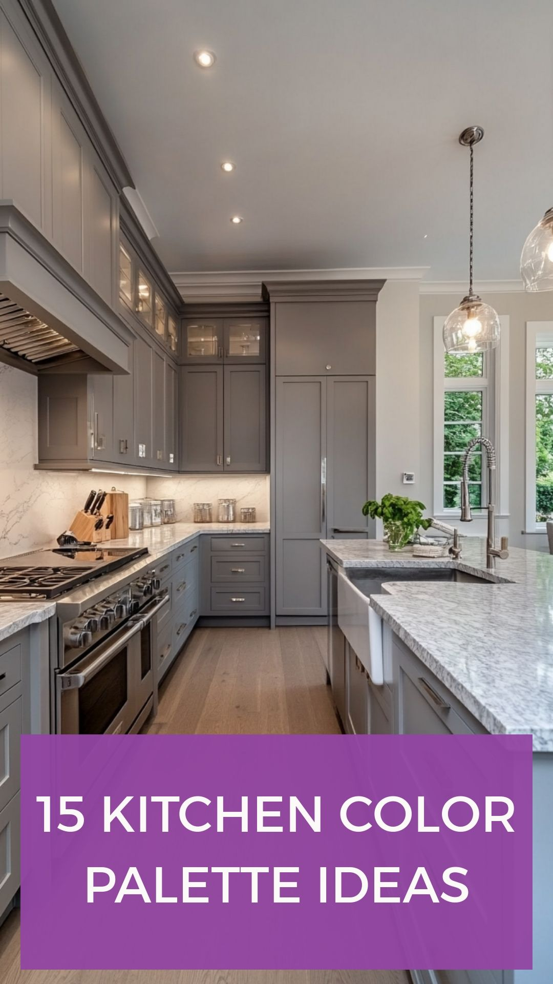
One of the most effective ways to stop guessing is to design your kitchen color schemes around a signature shade. Think of this as your anchor. It’s the color that sets the tone for everything else. This doesn’t mean your whole kitchen has to be one color. In fact, monotone kitchens can feel sterile. Instead, pick one dominant color for your largest surface area—usually the cabinets—and build around it. This could be a crisp white, a deep charcoal, a soft sage green, or even a bold navy. Once you have that anchor, the rest of the decisions become easier because you’re no longer starting from zero.
For example, if your signature shade is a warm walnut wood for your lower cabinets, you’ve already established a warm, organic base. Now, you can choose a lighter, neutral upper cabinet color like cream or off-white to keep the space feeling airy. Your countertop might be a quartz with subtle veining that picks up both the warm wood and the creamy white. Your backsplash could introduce a tiny bit of contrast, perhaps a handmade tile with a hint of terracotta to echo the warmth of the wood. See how it flows? By starting with one strong choice, the others fall into place naturally.
This approach also helps when you’re overwhelmed by options. Instead of trying to match five different elements perfectly, you let the signature shade lead. If you love black, make your island black. Then, keep the perimeter cabinets light to balance the visual weight. If you love blue, paint the island a deep navy and keep the walls neutral. The signature shade gives you permission to be bold in one area while keeping the rest of the room calm and cohesive. It’s a trick designers use constantly because it works. It creates focus without chaos.
Five Fool-Proof Color Combinations
If you’re still feeling stuck, let’s look at five combinations that designers swear by. These aren’t just random picks; they’re tested, timeless pairings that balance light, warmth, and contrast. First, there’s the classic Warm Wood and White. This is arguably the most popular combination for a reason. The warmth of natural wood grain softens the crispness of white, creating a space that feels clean but not clinical. It’s versatile, working in modern farmhouse, Scandinavian, and traditional styles alike. Just make sure the white has a slight warmth to it so it doesn’t clash with the wood’s yellow or orange undertones.
Second, try Dark Wood and Black. This combo is dramatic, moody, and incredibly sophisticated. It works best in larger kitchens with plenty of natural light, as dark colors can shrink a space visually. To keep it from feeling too heavy, introduce metallic accents like brass or gold hardware, and ensure your lighting is layered and bright. The contrast between the deep wood tones and the black creates a luxurious, hotel-like vibe. It’s bold, but when done right, it looks expensive and intentional.
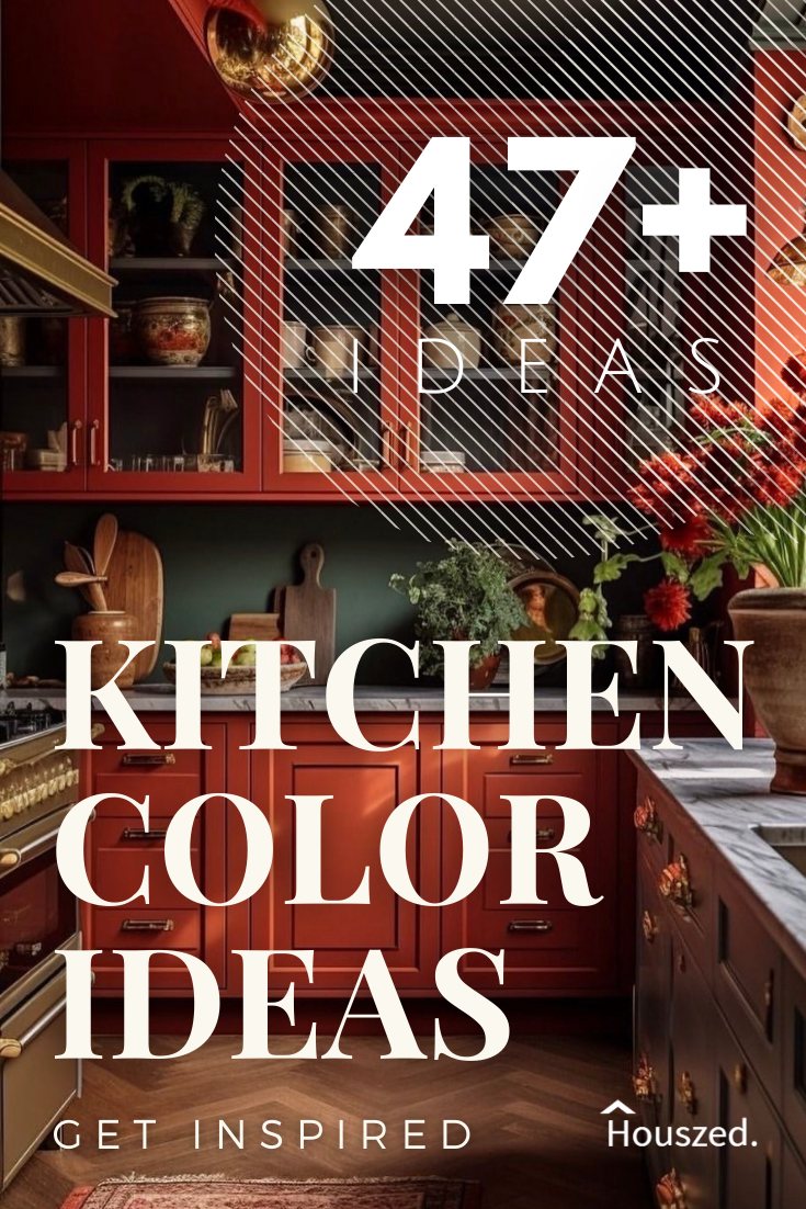
Third, consider Two-Tone Cabinetry. As Simon Temprell, interior design manager at Neptune, notes, it’s increasingly popular to use at least two colors on kitchen cabinetry, sometimes mixing timber cabinetry with painted finishes. A common approach is darker lowers and lighter uppers. This grounds the space while keeping the eye level open and airy. You might pair a deep green lower cabinet with a soft beige upper, or a navy base with crisp white tops. This adds visual interest and breaks up the monotony of a single-color scheme.
Fourth, don’t overlook Soft Neutrals with a Pop of Color. Think beige, greige, or taupe cabinets with a vibrant backsplash or colorful accessories. This allows you to play it safe with the big investments (cabinets) while adding personality through easier-to-change elements. A terracotta tile backsplash against cream cabinets, for instance, brings warmth and energy without committing to a full-colored wall. Finally, there’s the Monochromatic Layered Look. Using different shades of the same color family—like various tones of gray or blue—creates a serene, harmonious environment. The key here is texture. Mix matte, gloss, wood, and stone to keep it from looking boring.
Integrating Countertops and Backsplashes
Your cabinets might be the star, but countertops and backsplashes are the supporting actors that make the whole show work. When choosing these, think about continuity. Your countertop should bridge the gap between your cabinets and your walls. If you have busy wood grain cabinets, a solid, quiet countertop like pure white quartz or concrete can provide a visual rest. Conversely, if your cabinets are simple and flat-panel, a countertop with movement—like marble-veined quartz or granite—can add the necessary drama.
The backsplash is your chance to tie everything together. It sits right at the intersection of your countertops and upper cabinets, so it needs to complement both. If your countertop is busy, go for a simple subway tile in a color pulled from the counter’s veining. If your countertop is solid, you can go wilder with the backsplash. Patterned cement tiles, zellige tiles with irregular edges, or even a bold colored glass can become the focal point. In 2026, we’re seeing a move towards backsplashes that extend all the way to the ceiling, especially behind open shelving. This creates a vertical column of color that draws the eye up and makes the room feel taller.
Don’t forget the hardware. It’s the jewelry of the kitchen. Brushed nickel, matte black, brass, or copper—each finish interacts differently with your color palette. Warm metals like brass and copper look stunning against cool blues and greens, adding a touch of warmth. Cool metals like chrome and nickel pair well with grays and whites for a sleek, modern look. Black hardware creates a sharp, graphic contrast against light cabinets. Small details matter. They’re the finishing touches that signal whether a kitchen was designed with intention or just thrown together.
Lighting: The Hidden Color Changer
We touched on this earlier, but it bears repeating because it’s so critical. Lighting can make or break your color scheme. Most kitchens rely on three types of lighting: ambient, task, and accent. Ambient lighting is your general overhead light. Task lighting is under-cabinet strips or pendant lights over the island that help you chop veggies. Accent lighting highlights features like glass-front cabinets or artwork. Each of these layers affects how color is perceived.
Under-cabinet lighting is particularly important for color accuracy on your countertops and backsplash. If you use warm-white bulbs (2700K-3000K), your white quartz might look creamy and inviting. If you use cool-white bulbs (4000K+), that same quartz might look stark and blue. Consistency is key. Try to keep the color temperature of your bulbs consistent throughout the kitchen to avoid a disjointed feel. Dimmers are your best friend. They allow you to adjust the mood from bright and functional during meal prep to soft and atmospheric during dinner parties.
Natural light direction matters too. North-facing rooms get cool, indirect light, which can make colors look flatter and cooler. South-facing rooms get warm, direct light, which can intensify warm colors and wash out cool ones. If you have a north-facing kitchen, consider warming up your palette with creams, beiges, or warm grays to counteract the cool light. If you have a south-facing kitchen, you can get away with cooler tones because the sun will warm them up naturally. Always test your paint and materials in the specific light conditions of your own home. What looks great in the showroom might look completely different in your space.
At the end of the day, the best kitchen color scheme is one that reflects who you are. Trends will come and go. In 2026, we’re seeing a shift away from the all-white kitchens of the 2010s toward more personalized, character-filled spaces. People want kitchens that feel lived-in and authentic. This means it’s okay to break the rules if it feels right to you. Love pink? Use it. Prefer dark and moody? Go for it. The framework we’ve discussed is there to guide you, not restrict you. It’s about making informed choices so that your personal style shines through without clashing or feeling chaotic.
To keep your design timeless, focus on quality over quantity. Invest in good cabinetry and durable countertops in neutral or classic colors. Then, inject personality through paint on the walls, decorative tiles, rugs, and accessories. These are easier and cheaper to change than ripping out cabinets. A coat of paint can transform a kitchen in a weekend. Swapping out bar stools or adding a new runner rug can refresh the look seasonally. This flexibility allows you to evolve with your tastes without undergoing a major renovation every few years.
Remember, perfection isn’t the goal. Connection is. Your kitchen should feel like a hug when you walk in. It should support your daily rituals, from the morning rush to the slow Sunday brunch. When you stop guessing and start designing with intention, using these proven principles, you create a space that not only looks good but feels good. And that’s worth far more than following the latest trend. So take a breath. Look at your space. Pick your signature shade. And trust the process. You’ve got this.